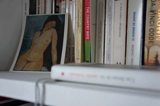
Recently in a couple of posts here on my blog, I discussed the importance of getting your brochure printing right. Essentially, the same common sense advice and forethought apply when you’re considering having some postcards printed.
If you have some postcard printing plans lined up, here are a few practical tips to keep in mind no matter why you’re having the cards printed up or how you intend to use them.
Keep it simple
We’re all inundated by so much information coming at use from so many angles these days. Do yourself and your target audience a favour with postcards that are easy to read (and on the eyes) and don’t overwhelm or overload with too many details or imagery crammed into a little space.
Share what’s key
It’s a postcard, not a novel (or even a brochure). If you’re even including text at all, stick with the key basics you’re trying to share and offer a URL and/or contact details for folks interesting in finding out more.
Choose a strong image
A picture’s worth a thousand words, right? And with so much junk mail and flyers and SPAM and whatnot cluttering up our doorways and mailboxes and inboxes and and and … you need to make sure you use strong and captivating graphics that encourage people to pick up and hold on to your postcard.
Simple, key and strong: that’s what makes a good postcard. Good luck printing yours.


